
Queue signage: guiding visitors without confusion
Queue signage is the last 10% that makes the difference between a functional queue and a truly efficient queue. Without clear signage, even the best organization generates repetitive questions: "Is this the line? Which counter? Is there a priority lane?". Here are the principles for signage that guides without confusion.
What is the purpose of queue signage?
Signage serves four complementary functions to guidance posts:
- Direct: indicate where the queue starts, where it ends, which service it leads to
- Inform: usage rules, estimated wait time, access conditions
- Differentiate: priority lanes (disabled, pregnant women, seniors), standard lanes, VIP lanes
- Reassure: a visitor who knows where they stand waits better than a lost visitor
Good signage reduces up to 30% of questions addressed to staff and measurably improves the visitor experience. It should be designed to complement belt barrier posts, never to replace them.
In which locations is it essential?
- Banks, government offices: multiple counters, different services, priority lanes
- Airports, train stations: multiple flows, control areas, boarding
- Hospitals, clinics: vulnerable public, emergencies, reception, consultations
- Museums: temporary exhibitions, audio guides, ticketing
- Trade shows: entry, ticketing, cloakroom, workshops
- Store checkout: queues by category (express, pickup, returns)
Types of signage to combine
Hanging signs
Visible from a distance (10-20 m), they direct from the building entrance. A3 format or larger, contrasting background color. Ideal for indicating services ("Checkouts 1-5", "Customer Service", "Returns").
Sign holders on posts
At the head of the queue or mid-way, A4 or A3 format on the post itself. Point information visible at 1-2 m. See sign holder for guidance post.
Floor marking
Stickers, tape, painted markings. Materialize waiting positions, distancing zones, traffic flow directions. Prefer non-slip and heavy-traffic resistant materials.
Directional arrows
Arrows on the floor, walls, hanging. Guide to services from the entrance. Consistent with hanging signs to avoid contradictions.
Digital signage (optional)
Dynamic screens displaying estimated wait times, next person called, commercial messages. Higher investment but measurable ROI in banks, hospitals, public services.
Key messages to display
Queue start
- "PLEASE WAIT HERE"
- "QUEUE — Customer Service"
- "ENTRANCE" + arrow
Differentiation
- "PRIORITY LANE — pregnant women, disabled, seniors"
- "VIP — sponsors, press"
- "ORDER PICKUP" vs "IN-STORE PURCHASE"
Service information
- "OPEN" / "CLOSED"
- "Next available counter: X"
- "Estimated wait time: Y minutes"
Rules and instructions
- "ID required"
- "Card payment only"
- "Photography prohibited" / "Flash-free photography allowed"
Design principles
- High contrast: black text on white background, or white on saturated color
- Sans-serif typography: more readable at distance than serif
- Maximum 7 words per main message
- Visual hierarchy: large title, medium subtitle, small details
- Color consistency: same color code throughout the building
- Placement height: hanging sign at 2.2-2.5 m, sign holder at 100-110 cm
Common mistakes
- Overloading messages: too much text kills the message. 5-7 words maximum per display.
- Inconsistent colors: blue for VIP in one area, red for VIP in another. Standardize.
- Forgetting multilingual in tourist areas (airports, museums). Plan for English minimum.
- Wrong height placement: too high, you lift your head; too low, you bend down. 100-110 cm remains ideal for sign holders.
- Irregular updates: an outdated message ("Expired promotion") harms credibility. Plan a review schedule.
Case study: town hall signage
For a medium-sized town hall with 5 different services:
- Hanging sign at entrance: list of services + directional arrows
- Secondary signs in front of each service: "Civil Status", "Urban Planning", "Land Registry"
- A4 sign holders on posts at queue head: "Wait here"
- Floor marking to materialize positions
- Small sign "Priority lane" for disabled / pregnant women
- Information screen with digital ticketing (optional but recommended)
For the overall view, return to the complete professional guidance post guide. Also see queue management and sign holders for posts. Check our wall-mounted barrier catalog.
FAQ
What height for a hanging sign?
2.2 to 2.5 m from the ground for a hanging directional sign. This height allows reading from a distance without hindering traffic. For sign holders on posts, aim for 100-110 cm from the ground.
How many words per display?
5 to 7 words maximum for titles and main instructions. More text becomes difficult to read while passing. Use sans-serif typography and high contrast (black on white).
Should multilingual signage be planned?
Mandatory in international tourist areas (airports, international train stations, major museums). Recommended in tourist cities. Standard: English. Add Spanish/German/Dutch depending on target audience.
What color code to use for differentiating queues?
Common standards: blue for general public, red or gold for VIP, yellow for priority (disabled, pregnant women), green for exit/evacuation. Most important is keeping the code consistent throughout the establishment.
How much does a complete signage system cost?
For a medium-sized agency or town hall: €800 to €2,000 excl. tax for signs and sign holders (excluding digital signage). An information screen with ticket management costs an additional €1,500 to €5,000 excl. tax.
Related products
-

-

LINE Series A4 Display Holder
Price: €74.50A4 display holder for LINE series museum barrier posts (post to be ordered... -

Sign Frame Holder for BELTRAC Rope and Belt Barrier Posts
Price: €72.00Chrome poster holder compatible with BELTRAC rope barrier posts. -

-

Related posts
-
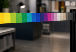 Pantone Printing on Belts: Guaranteeing Your Brand's Exact Colour
How to guarantee your brand's exact colour on a printed belt: RGB vs CMYK vs Pantone, colour tolerances, sample...Read More
Pantone Printing on Belts: Guaranteeing Your Brand's Exact Colour
How to guarantee your brand's exact colour on a printed belt: RGB vs CMYK vs Pantone, colour tolerances, sample...Read More -
 5m Belt Stanchion Post: Complete Guide, Uses and Configuration Tips
Everything about the 5m belt stanchion post: comparison with standard, 6 use cases, post calculation, technical specs...Read More
5m Belt Stanchion Post: Complete Guide, Uses and Configuration Tips
Everything about the 5m belt stanchion post: comparison with standard, 6 use cases, post calculation, technical specs...Read More -
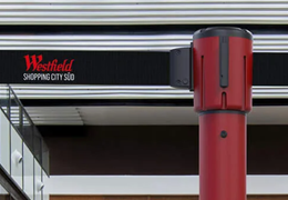
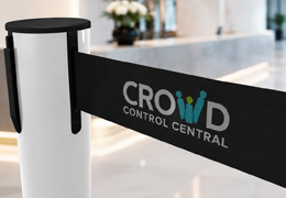 Custom Belt Stanchion: Turn Your Queues into a Brand Communication Space
Everything about custom belt stanchions: print options (logo, Pantone, full length), brand benefits, sector...Read More
Custom Belt Stanchion: Turn Your Queues into a Brand Communication Space
Everything about custom belt stanchions: print options (logo, Pantone, full length), brand benefits, sector...Read More -
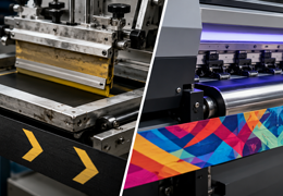 Screen Printing or Sublimation on Belts: Which Technique?
In-depth technical comparison screen printing vs sublimation for belt printing: colour count, UV resistance, photo...Read More
Screen Printing or Sublimation on Belts: Which Technique?
In-depth technical comparison screen printing vs sublimation for belt printing: colour count, UV resistance, photo...Read More -
 Museum and Exhibition Guidance: Discretion, Security, and Showcasing
Crowd control solutions for museums and art galleries. Slim, elegant stanchions that protect artworks while guiding...Read More
Museum and Exhibition Guidance: Discretion, Security, and Showcasing
Crowd control solutions for museums and art galleries. Slim, elegant stanchions that protect artworks while guiding...Read More