Customer Journey
Pantone Printing on Straps: Guaranteeing Your Brand's Exact Color
How to guarantee your brand's exact colour on a printed belt: RGB vs CMYK vs Pantone,...

Recevez en temps réel le statut de votre livraison
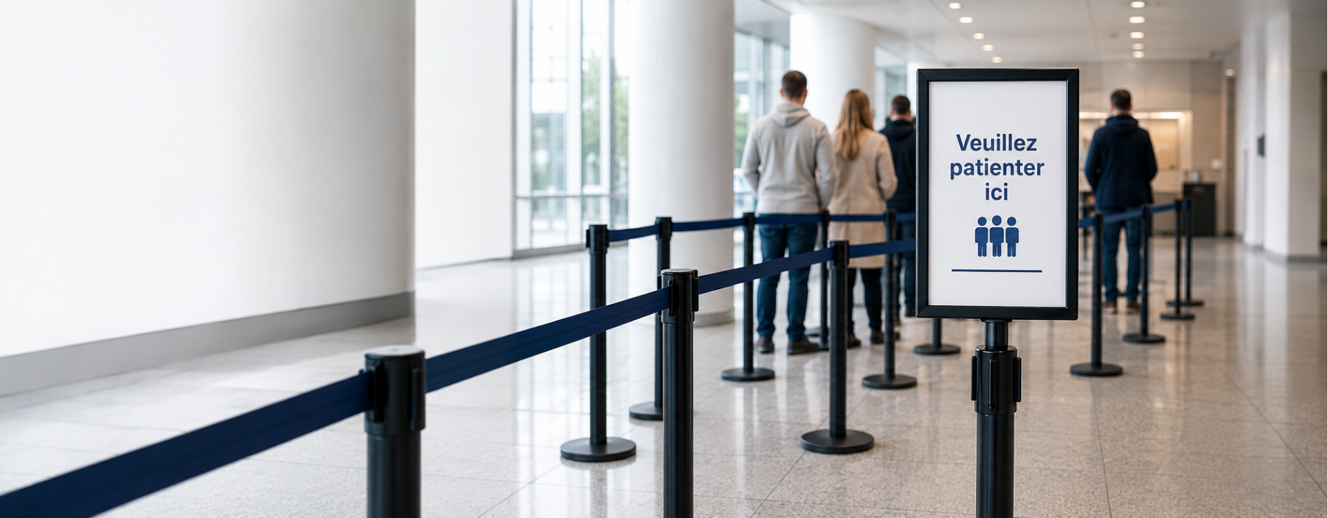
Queue signage is the last 10% that makes the difference between a functional queue and a truly efficient queue. Without clear signage, even the best organization generates repetitive questions: "Is this the line? Which counter? Is there a priority lane?". Here are the principles for signage that guides without confusion.
Signage serves four complementary functions to guidance posts:
Good signage reduces up to 30% of questions addressed to staff and measurably improves the visitor experience. It should be designed to complement belt barrier posts, never to replace them.
Visible from a distance (10-20 m), they direct from the building entrance. A3 format or larger, contrasting background color. Ideal for indicating services ("Checkouts 1-5", "Customer Service", "Returns").
At the head of the queue or mid-way, A4 or A3 format on the post itself. Point information visible at 1-2 m. See sign holder for guidance post.
Stickers, tape, painted markings. Materialize waiting positions, distancing zones, traffic flow directions. Prefer non-slip and heavy-traffic resistant materials.
Arrows on the floor, walls, hanging. Guide to services from the entrance. Consistent with hanging signs to avoid contradictions.
Dynamic screens displaying estimated wait times, next person called, commercial messages. Higher investment but measurable ROI in banks, hospitals, public services.
For a medium-sized town hall with 5 different services:
For the overall view, return to the complete professional guidance post guide. Also see queue management and sign holders for posts. Check our wall-mounted barrier catalog.
2.2 to 2.5 m from the ground for a hanging directional sign. This height allows reading from a distance without hindering traffic. For sign holders on posts, aim for 100-110 cm from the ground.
5 to 7 words maximum for titles and main instructions. More text becomes difficult to read while passing. Use sans-serif typography and high contrast (black on white).
Mandatory in international tourist areas (airports, international train stations, major museums). Recommended in tourist cities. Standard: English. Add Spanish/German/Dutch depending on target audience.
Common standards: blue for general public, red or gold for VIP, yellow for priority (disabled, pregnant women), green for exit/evacuation. Most important is keeping the code consistent throughout the establishment.
For a medium-sized agency or town hall: €800 to €2,000 excl. tax for signs and sign holders (excluding digital signage). An information screen with ticket management costs an additional €1,500 to €5,000 excl. tax.


Related posts
How to guarantee your brand's exact colour on a printed belt: RGB vs CMYK vs Pantone,...
Everything about the 5m belt stanchion post: comparison with standard, 6 use cases,...
Everything about custom belt stanchions: print options (logo, Pantone, full length),...
In-depth technical comparison screen printing vs sublimation for belt printing: colour...
Crowd control solutions for museums and art galleries. Slim, elegant stanchions that...